Field Types Reference
Qivra Form Builder offers a variety of field types to collect different kinds of information. This reference guide covers all available fields and when to use each one.
Input Fields
Section titled “Input Fields”Text Input
Section titled “Text Input”The most versatile field for collecting short text responses.
| Property | Description |
|---|---|
| Use For | Names, addresses, titles, short answers |
| Validation | Min/max length, required |
| Settings | Label, placeholder, default value |
Best Practices:
- Use for single-line responses
- Set appropriate character limits
- Provide clear placeholders
Email Input
Section titled “Email Input”Specialized field for email addresses with built-in validation.
| Property | Description |
|---|---|
| Use For | Email addresses |
| Validation | Email format validation, required |
| Settings | Label, placeholder, default value |
Best Practices:
- Always mark as required for contact forms
- Email format is automatically validated
- Use for notification recipients
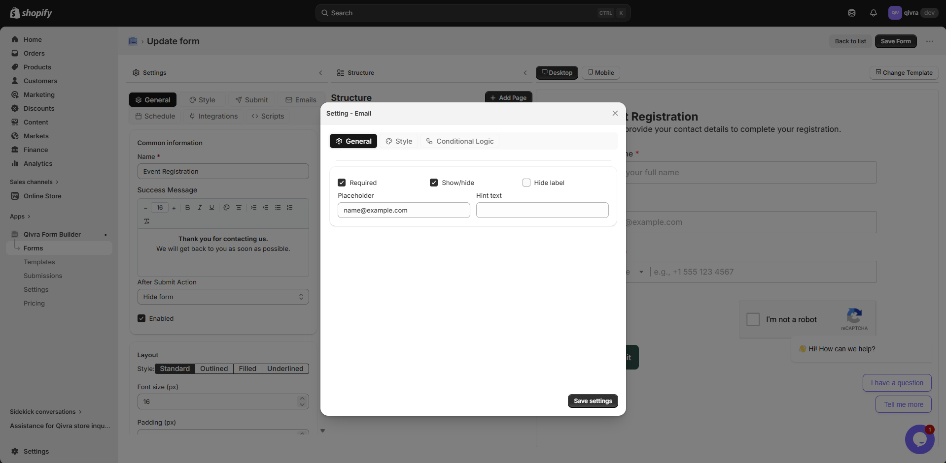
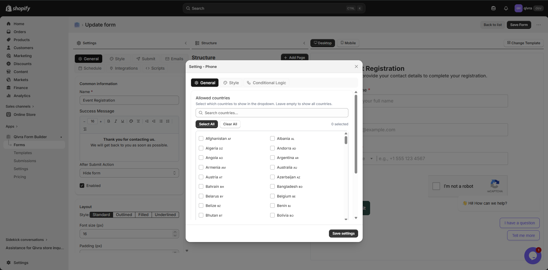
Phone Input
Section titled “Phone Input”Field for collecting phone numbers.
| Property | Description |
|---|---|
| Use For | Phone numbers |
| Validation | Phone format, required |
| Settings | Label, placeholder, default value |
Best Practices:
- Consider international formats
- Add placeholder with expected format
- Use for callback requests
Number Input
Section titled “Number Input”Field for numeric values only.
| Property | Description |
|---|---|
| Use For | Quantities, ages, prices, measurements |
| Validation | Min/max values, required |
| Settings | Label, placeholder, default value, step |
Best Practices:
- Set min/max limits when appropriate
- Use for quantities in order forms
- Great for age verification
Date Input
Section titled “Date Input”Date picker for selecting dates.
| Property | Description |
|---|---|
| Use For | Birthdays, appointment dates, deadlines |
| Validation | Date format, required |
| Settings | Label, placeholder, min/max date |
Best Practices:
- Set reasonable date ranges
- Use for booking and scheduling
- Perfect for date of birth collection
Selection Fields
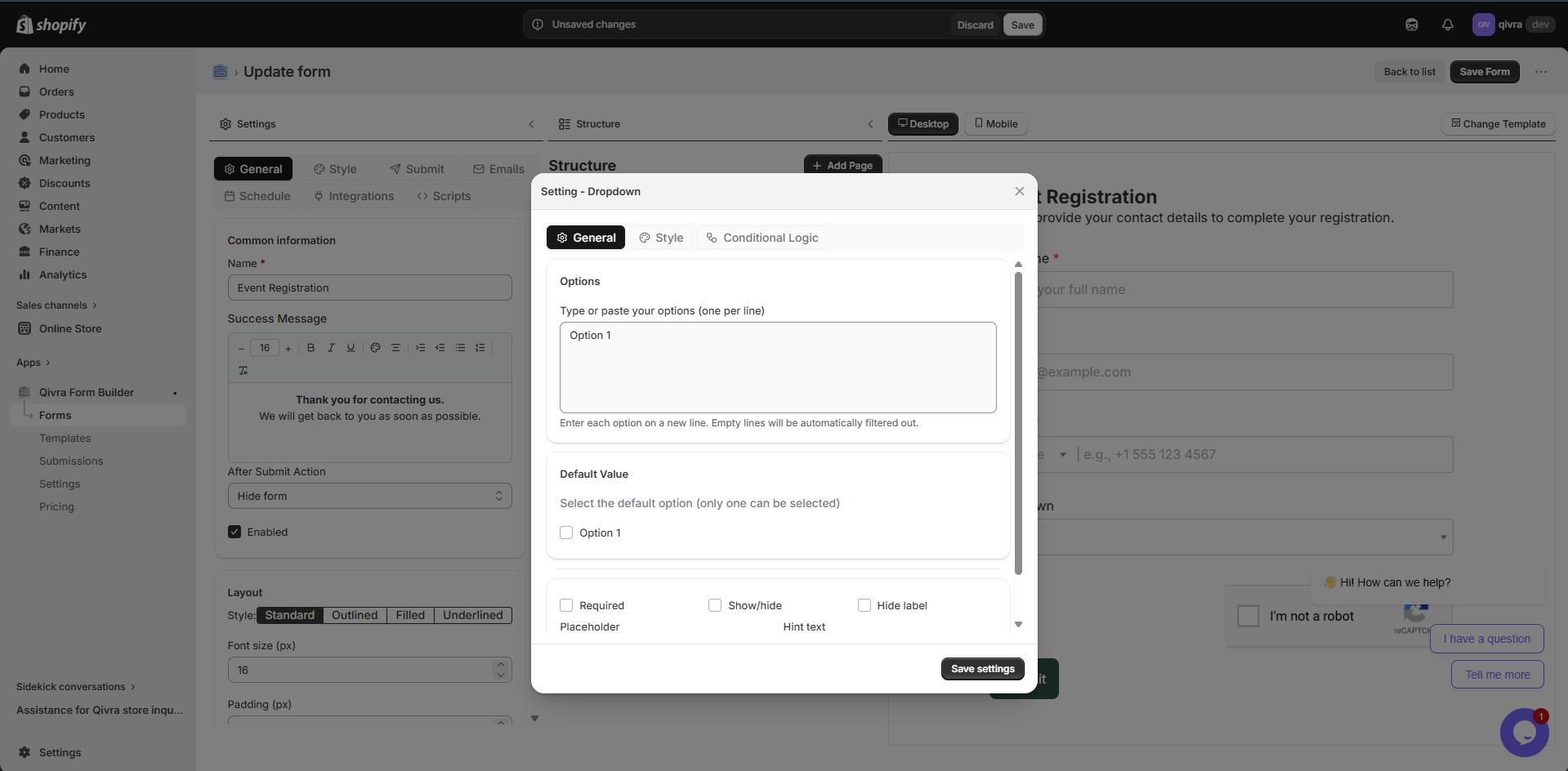
Section titled “Selection Fields”Dropdown
Section titled “Dropdown”Dropdown menu for selecting one option from a list.
| Property | Description |
|---|---|
| Use For | Long lists of options, single selection |
| Validation | Required |
| Settings | Label, options list, default selection |
When to Use:
- More than 5 options
- Limited space on form
- Options don’t need to be visible at once
Best Practices:
- Order options logically
- Keep option text concise
- Consider “Other” option for unexpected choices
Radio Buttons (Choice List)
Section titled “Radio Buttons (Choice List)”Mutually exclusive options displayed as a list.
| Property | Description |
|---|---|
| Use For | 2-5 options, single selection |
| Validation | Required |
| Settings | Label, options list, layout (vertical/horizontal) |
When to Use:
- 2-5 options to choose from
- All options should be visible
- Important to compare options
Best Practices:
- Use for Yes/No questions
- Great for rating scales
- Keep option text brief
Checkbox
Section titled “Checkbox”Single checkbox or multiple checkboxes for selections.
| Property | Description |
|---|---|
| Use For | Agreements, multiple selections, opt-ins |
| Validation | Required (for agreements) |
| Settings | Label, options list (for multiple) |
Types:
| Type | Use Case |
|---|---|
| Single Checkbox | Terms agreement, newsletter opt-in |
| Multiple Checkboxes | Select multiple interests, features |
Best Practices:
- Use for terms and conditions
- Great for “Select all that apply”
- Keep checkbox labels clear and concise
Content & Layout
Section titled “Content & Layout”Text Block
Section titled “Text Block”Rich text content area for instructions, headings, or descriptions.
| Property | Description |
|---|---|
| Use For | Instructions, headings, descriptions, policies |
| Features | Rich text formatting, links, lists |
| Settings | Content, styling options |
Formatting Options:
- Bold, italic, underline
- Headings (H1-H6)
- Bullet and numbered lists
- Links
- Text alignment
Best Practices:
- Add instructions before complex sections
- Use for form introductions
- Include policies or disclaimers
Divider
Section titled “Divider”Visual separator between form sections.
| Property | Description |
|---|---|
| Use For | Separating form sections |
| Settings | Style, color, spacing |
When to Use:
- Between distinct sections
- After introductory text
- Before submission button
Best Practices:
- Don’t overuse dividers
- Use to improve visual hierarchy
- Combine with text blocks for section headers
Special Fields
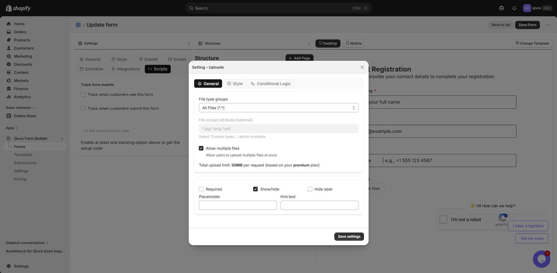
Section titled “Special Fields”File Upload
Section titled “File Upload”Allow customers to upload files with their submission.
| Property | Description |
|---|---|
| Use For | Documents, images, screenshots, resumes |
| Validation | File type, file size, required |
| Settings | Label, allowed types, max size, max files |
Supported File Types:
- Images: JPG, PNG, GIF, WEBP
- Documents: PDF, DOC, DOCX
- Spreadsheets: XLS, XLSX, CSV
- Others: ZIP, TXT
Best Practices:
- Limit file size (recommend 10MB max)
- Specify allowed file types
- Great for product customization requests
- Use for warranty registration with receipts
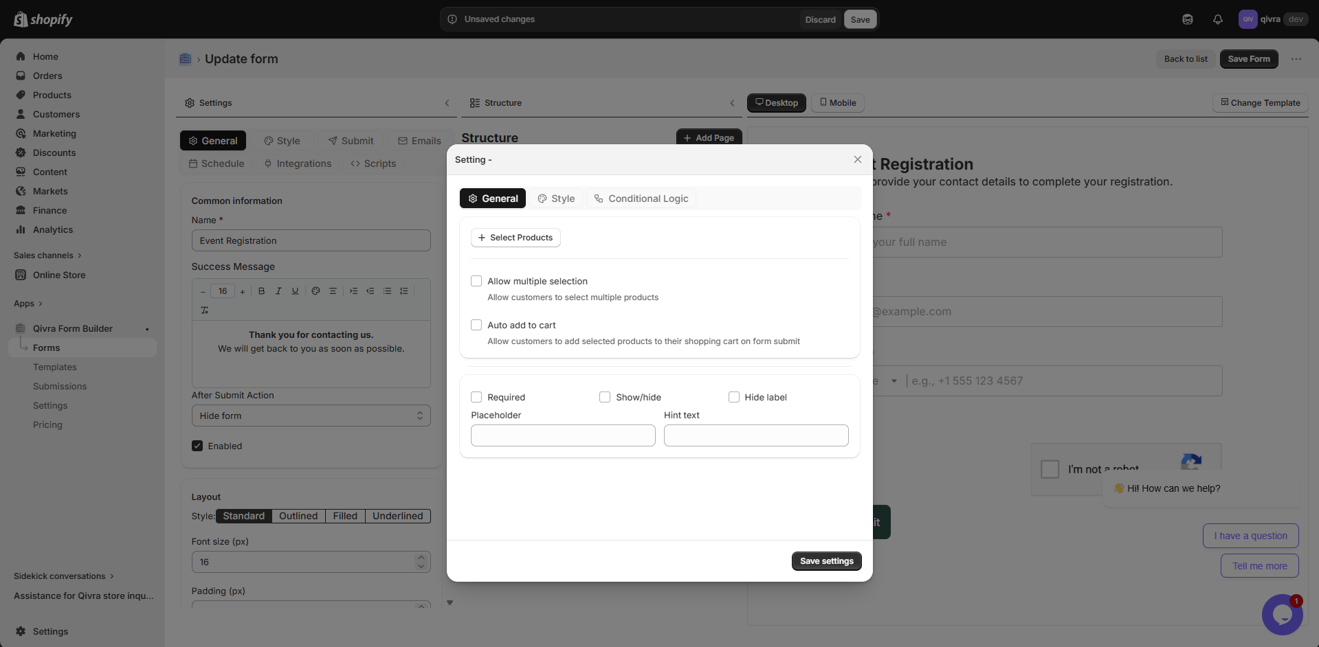
Product Selector
Section titled “Product Selector”Specialized field for selecting products from your Shopify store.
| Property | Description |
|---|---|
| Use For | Product inquiries, warranty registration, reviews |
| Features | Search products, display product images |
| Settings | Label, required, single/multiple selection |
When to Use:
- Product feedback forms
- Warranty registration
- Return/exchange requests
- Product inquiries
Best Practices:
- Use for forms related to specific products
- Great for customer support forms
- Helps track issues by product
Star Rating
Section titled “Star Rating”Visual rating field for collecting user feedback and reviews.
| Property | Description |
|---|---|
| Use For | Product reviews, customer satisfaction, service ratings |
| Settings | Label, number of stars (1-10), required |
Best Practices:
- Use for customer satisfaction surveys
- Great for product review forms
- Keep star count to 5 for consistency
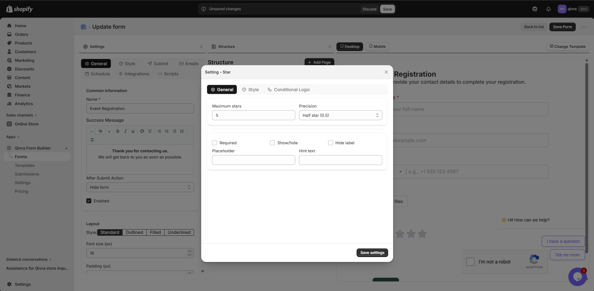
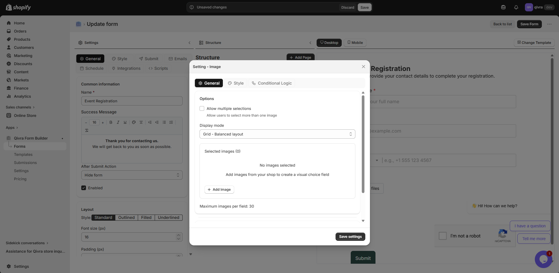
Image Choice
Section titled “Image Choice”Visual selection field where users choose from image-based options.
| Property | Description |
|---|---|
| Use For | Visual product selection, style preferences, design choices |
| Settings | Label, image options, required, single/multiple selection |
When to Use:
- Product variant selection
- Style or design preference
- Visual categorization
Best Practices:
- Use high-quality images for each option
- Keep option text concise
- Ensure images load quickly
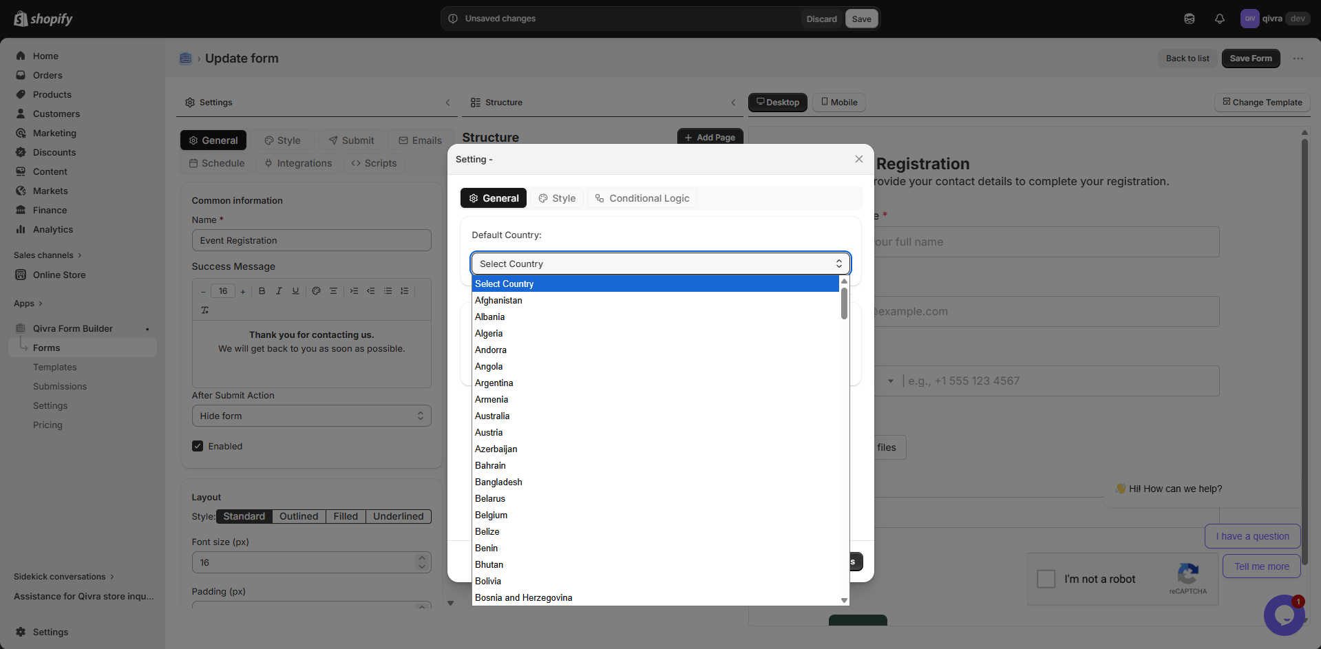
Country Selector
Section titled “Country Selector”Dropdown field pre-populated with all countries.
| Property | Description |
|---|---|
| Use For | Shipping forms, international inquiries, address collection |
| Settings | Label, required, default selection |
Best Practices:
- Set default to your primary market
- Use for international shipping forms
- Combine with address fields
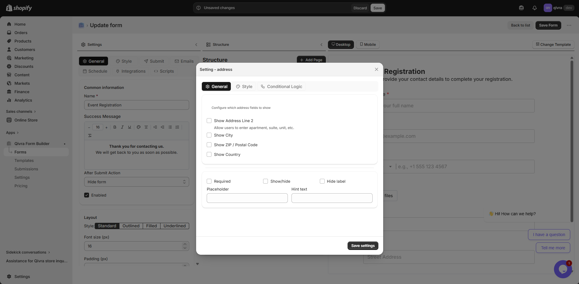
Address Field
Section titled “Address Field”Composite field for collecting complete addresses.
| Property | Description |
|---|---|
| Use For | Shipping addresses, business addresses, billing info |
| Settings | Label, required, layout options |
Best Practices:
- Use for order forms and shipping
- Combine with Country Selector
- Consider auto-fill support
Color Picker
Section titled “Color Picker”Visual color selection field with a color palette.
| Property | Description |
|---|---|
| Use For | Product customization, design preferences, color orders |
| Settings | Label, required, default color |
Best Practices:
- Use for custom product orders
- Great for print or design businesses
- Provide default color suggestions
Time Picker
Section titled “Time Picker”Time selection field with a dropdown or input interface.
| Property | Description |
|---|---|
| Use For | Appointment times, scheduling, delivery windows |
| Settings | Label, required, time format (12h/24h) |
Best Practices:
- Combine with Date picker for full scheduling
- Set appropriate time intervals
- Use 12h format for customer-facing forms
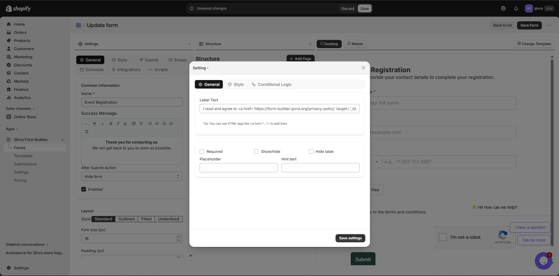
Terms & Conditions
Section titled “Terms & Conditions”Specialized checkbox for legal agreements and consent.
| Property | Description |
|---|---|
| Use For | Terms acceptance, privacy consent, policy agreements |
| Settings | Label, required, link to terms page |
Best Practices:
- Always make required for legal compliance
- Include a link to your full terms page
- Use clear, simple language
Spacer
Section titled “Spacer”Layout element for adding vertical spacing between fields.
| Property | Description |
|---|---|
| Use For | Visual breathing room, section separation |
| Settings | Height |
Best Practices:
- Use to improve form readability
- Don’t overuse - can make forms feel long
- Combine with dividers for clear sections
Field Type Comparison
Section titled “Field Type Comparison”| Field Type | Category | Input Type | Best For |
|---|---|---|---|
| Text | Basic | Free text | Names, short answers |
| Basic | Validated email | Email collection | |
| Phone | Basic | Phone number | Contact numbers |
| Number | Basic | Numeric | Quantities, ages |
| Date | Basic | Date picker | Dates, birthdays |
| Time | Basic | Time picker | Appointments, schedules |
| Dropdown | Choice | Single select | Long option lists |
| Radio | Choice | Single select | Short option lists |
| Checkbox | Choice | Multiple select | Multiple options |
| Image Choice | Choice | Visual select | Visual options |
| File Upload | Advanced | File input | Documents, images |
| Product Selector | Advanced | Product picker | Product-related forms |
| Star Rating | Advanced | Star rating | Reviews, feedback |
| Country Selector | Advanced | Dropdown | International forms |
| Address | Advanced | Composite | Shipping, billing |
| Color Picker | Advanced | Color input | Customization |
| Terms & Conditions | Advanced | Checkbox | Legal consent |
Choosing the Right Field
Section titled “Choosing the Right Field”Decision Guide
Section titled “Decision Guide”-
Need text input?
- Email address → Email Input
- Phone number → Phone Input
- Number only → Number Input
- Date → Date Input
- Time → Time Picker
- General text → Text Input
-
Need selection?
- Single choice, many options → Dropdown
- Single choice, few options → Radio
- Multiple choices → Checkbox
- Visual options → Image Choice
-
Need files?
- File Upload
-
Need to display content?
- Instructions/headings → Text Block
- Visual separation → Divider
- Spacing → Spacer
-
Need product or store integration?
- Product Selector
- Country Selector
- Address Field
-
Need feedback or consent?
- Rating/feedback → Star Rating
- Legal consent → Terms & Conditions
- Color choice → Color Picker