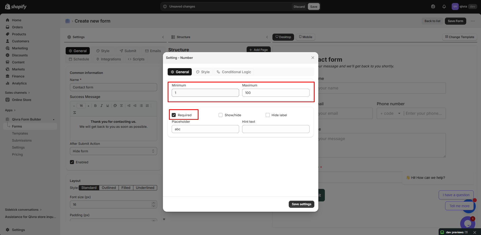
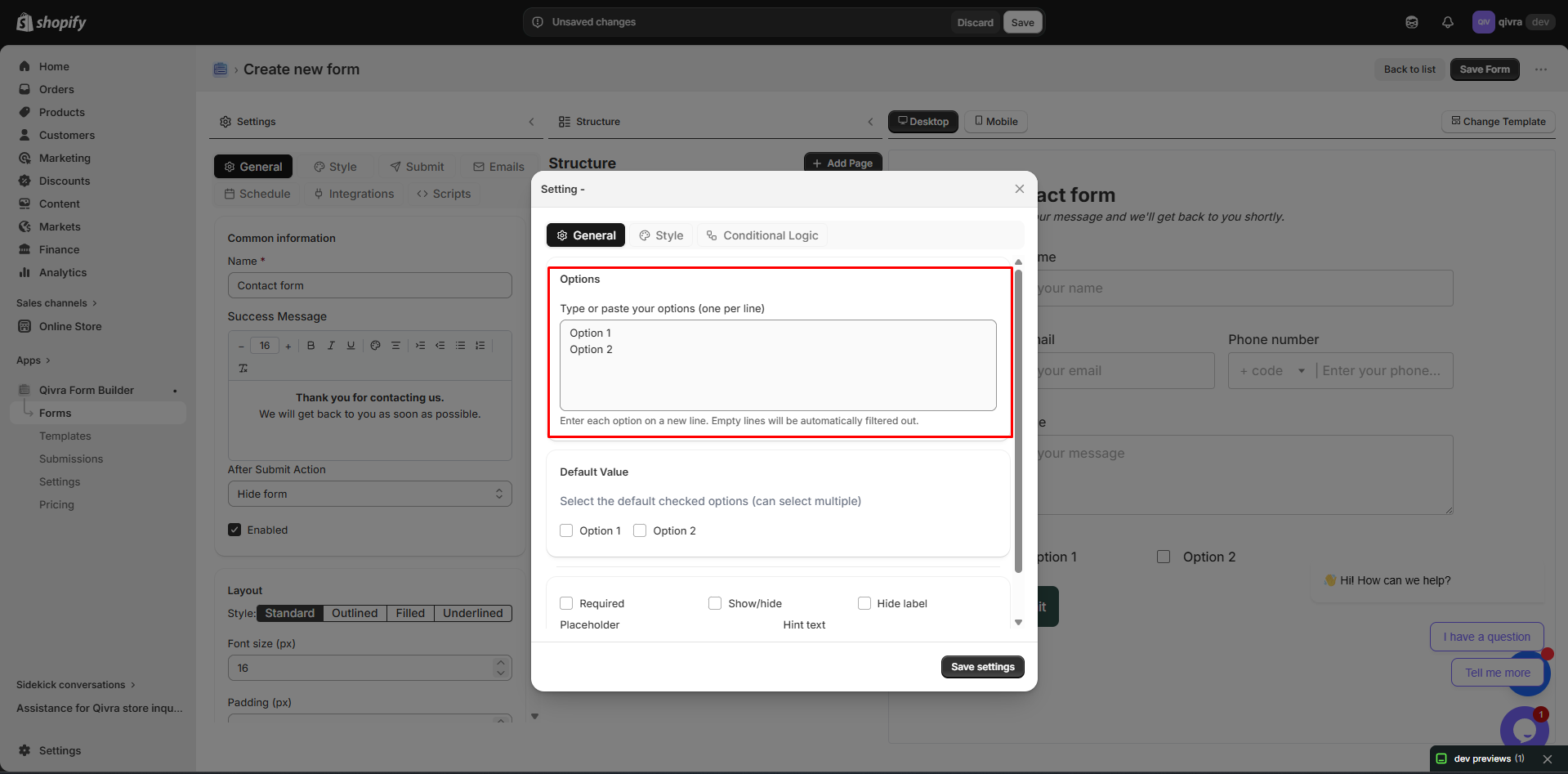
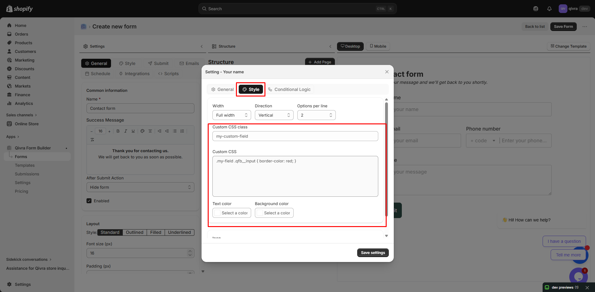
Field Settings
Each field in your form has customizable settings that control its appearance, behavior, and validation. This guide covers all available field settings and how to use them.
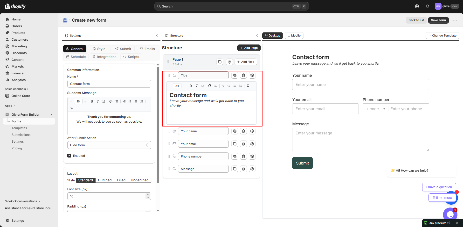
Accessing Field Settings
Section titled “Accessing Field Settings”- Click on any field in the form preview
- Field settings appear in the left panel
- Settings vary based on field type
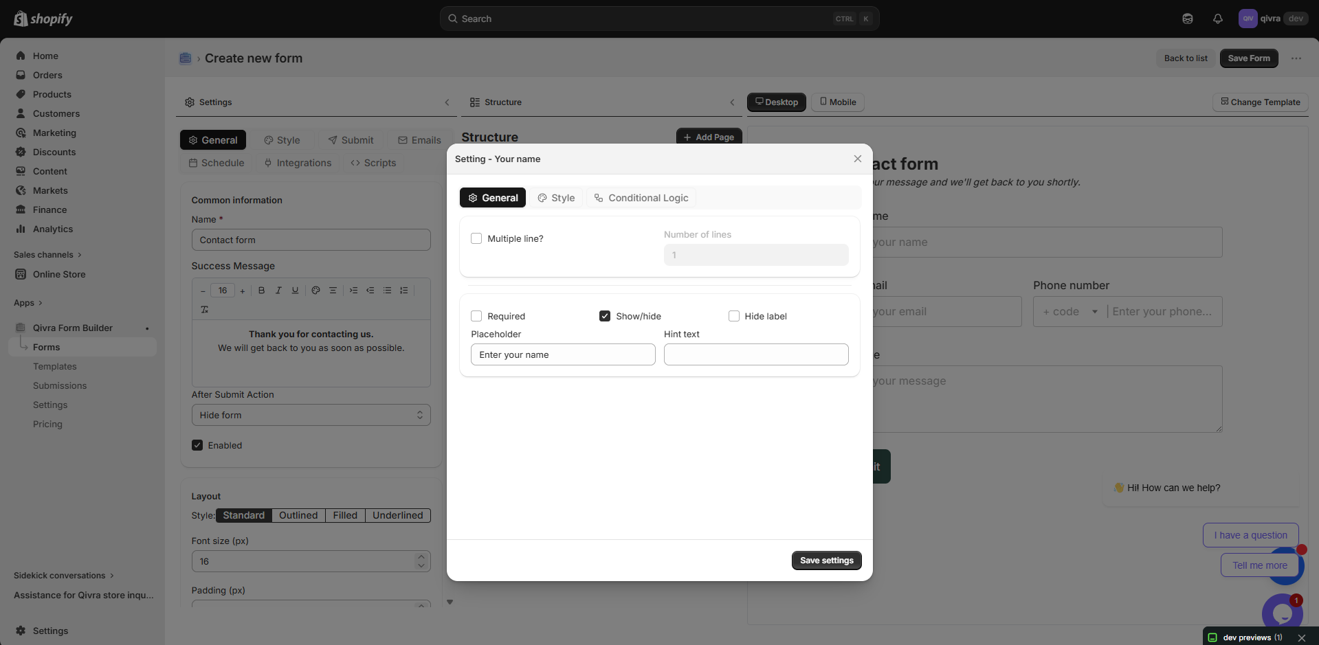
Common Settings
Section titled “Common Settings”These settings are available for most field types:
The name displayed above the field.
| Setting | Description |
|---|---|
| Label Text | The field name shown to customers |
| Required | Appears as text input |
Best Practices:
- Use clear, descriptive labels
- Keep labels concise
- Use consistent naming conventions
Hide Label
Section titled “Hide Label”Remove the label text from display.
| Option | Effect |
|---|---|
| Off | Label is visible (default) |
| On | Label text is hidden |
When to Use:
- Placeholder text is self-explanatory
- Minimal design aesthetic
- Checkbox fields with descriptive text
Keep Label Space
Section titled “Keep Label Space”Maintain label spacing even when label is hidden.
| Option | Effect |
|---|---|
| Off | No space reserved for label |
| On | Space maintained for alignment |
When to Use:
- Maintaining vertical alignment across columns
- Consistent spacing in grid layouts
Placeholder
Section titled “Placeholder”Hint text displayed inside empty fields.
Best Practices:
- Provide format examples (e.g., “john@example.com”)
- Keep placeholders short
- Don’t repeat the label
Required
Section titled “Required”Make the field mandatory for form submission.
| Option | Effect |
|---|---|
| Off | Field is optional |
| On | Field must be filled to submit |
Visual Indicator:
- Required fields show an asterisk (*)
- Form cannot be submitted if required fields are empty
Default Value
Section titled “Default Value”Pre-fill the field with a value.
Use Cases:
- Country field defaulting to primary market
- Suggested values for guidance
- Pre-populated known information
Layout Settings
Section titled “Layout Settings”Column Width
Section titled “Column Width”Control how much horizontal space a field occupies.
| Width | Fraction | Use For |
|---|---|---|
| Full | 100% | Most fields, especially text areas |
| 1/2 | 50% | Name (first/last), city/state pairs |
| 1/3 | 33% | Date fields, short inputs |
| 1/4 | 25% | Very short inputs, numbers |
Example Layout:
[First Name 1/2] [Last Name 1/2][Email Full ][City 1/3] [State 1/3] [ZIP 1/3]Field Toolbar Width Options
Section titled “Field Toolbar Width Options”Quickly change width from the field toolbar:
- Hover over the field
- Click the Width icon
- Select desired width
Validation Settings
Section titled “Validation Settings”Text Validation
Section titled “Text Validation”For text input fields:
| Setting | Description |
|---|---|
| Min Length | Minimum characters required |
| Max Length | Maximum characters allowed |
Number Validation
Section titled “Number Validation”For number input fields:
| Setting | Description |
|---|---|
| Min Value | Lowest acceptable number |
| Max Value | Highest acceptable number |
| Step | Increment value (1, 0.5, 0.01, etc.) |
File Validation
Section titled “File Validation”For file upload fields:
| Setting | Description |
|---|---|
| Allowed Types | File extensions permitted |
| Max File Size | Largest file accepted (in MB) |
| Max Files | Number of files allowed |
Selection Field Settings
Section titled “Selection Field Settings”Options Configuration
Section titled “Options Configuration”For dropdown, radio, and checkbox fields:
Adding Options
Section titled “Adding Options”- Find the Options section in settings
- Enter your option text (NOTE: each line break counts as one option).
- Repeat for all needed options
Managing Options
Section titled “Managing Options”| Action | How To |
|---|---|
| Reorder | Drag options to new positions |
| Edit | Click on option text to edit |
| Delete | Click the X icon next to option |
| Default | Set which option is pre-selected |
Layout Options (Radio/Checkbox)
Section titled “Layout Options (Radio/Checkbox)”| Layout | Best For |
|---|---|
| Vertical | Longer option text, many options |
| Horizontal | Short options, Yes/No questions |
Advanced Settings
Section titled “Advanced Settings”Conditional Logic
Section titled “Conditional Logic”Show or hide fields based on other field values.
Setup:
- Scroll to Conditional Logic section
- Enable conditional logic
- Set the condition rules
Example:
Show "Company Name" fieldWhen "Business Type" equals "Business"See Conditional Logic for detailed guide.
Custom CSS Classes
Section titled “Custom CSS Classes”Add custom CSS classes for advanced styling.
Use Cases:
- Custom styling from theme
- JavaScript targeting
- Advanced layout control
Field-Specific Settings
Section titled “Field-Specific Settings”Text Block Settings
Section titled “Text Block Settings”| Setting | Description |
|---|---|
| Content | Rich text editor for content |
| Text Alignment | Left, center, right, justify |
Divider Settings
Section titled “Divider Settings”| Setting | Description |
|---|---|
| Style | Solid, dashed, dotted |
| Color | Line color |
| Width | Full or partial width |
| Spacing | Space above and below |
Product Selector Settings
Section titled “Product Selector Settings”| Setting | Description |
|---|---|
| Selection Type | Single or multiple products |
| Show Images | Display product thumbnails |
| Search | Enable product search |
Settings Quick Reference
Section titled “Settings Quick Reference”| Setting | Text | Phone | Number | Date | Dropdown | Radio | Checkbox | File | |
|---|---|---|---|---|---|---|---|---|---|
| Label | ✅ | ✅ | ✅ | ✅ | ✅ | ✅ | ✅ | ✅ | ✅ |
| Hide Label | ✅ | ✅ | ✅ | ✅ | ✅ | ✅ | ✅ | ✅ | ✅ |
| Placeholder | ✅ | ✅ | ✅ | ✅ | ✅ | ❌ | ❌ | ❌ | ❌ |
| Required | ✅ | ✅ | ✅ | ✅ | ✅ | ✅ | ✅ | ✅ | ✅ |
| Default Value | ✅ | ✅ | ✅ | ✅ | ✅ | ✅ | ✅ | ✅ | ❌ |
| Column Width | ✅ | ✅ | ✅ | ✅ | ✅ | ✅ | ✅ | ✅ | ✅ |
| Conditional Logic | ✅ | ✅ | ✅ | ✅ | ✅ | ✅ | ✅ | ✅ | ✅ |
Tips for Effective Field Settings
Section titled “Tips for Effective Field Settings”User Experience
Section titled “User Experience”- Group related fields together
- Use appropriate field widths
- Provide helpful placeholders
- Mark truly required fields only
Data Quality
Section titled “Data Quality”- Use validation to ensure correct formats
- Set reasonable min/max values
- Limit file types for uploads
Visual Consistency
Section titled “Visual Consistency”- Keep labels consistent in style
- Use uniform field widths for similar data
- Maintain alignment across the form