The Form Builder is where you create and customize your forms. This guide provides a comprehensive overview of the interface and its features.
The Form Builder is divided into three main areas:
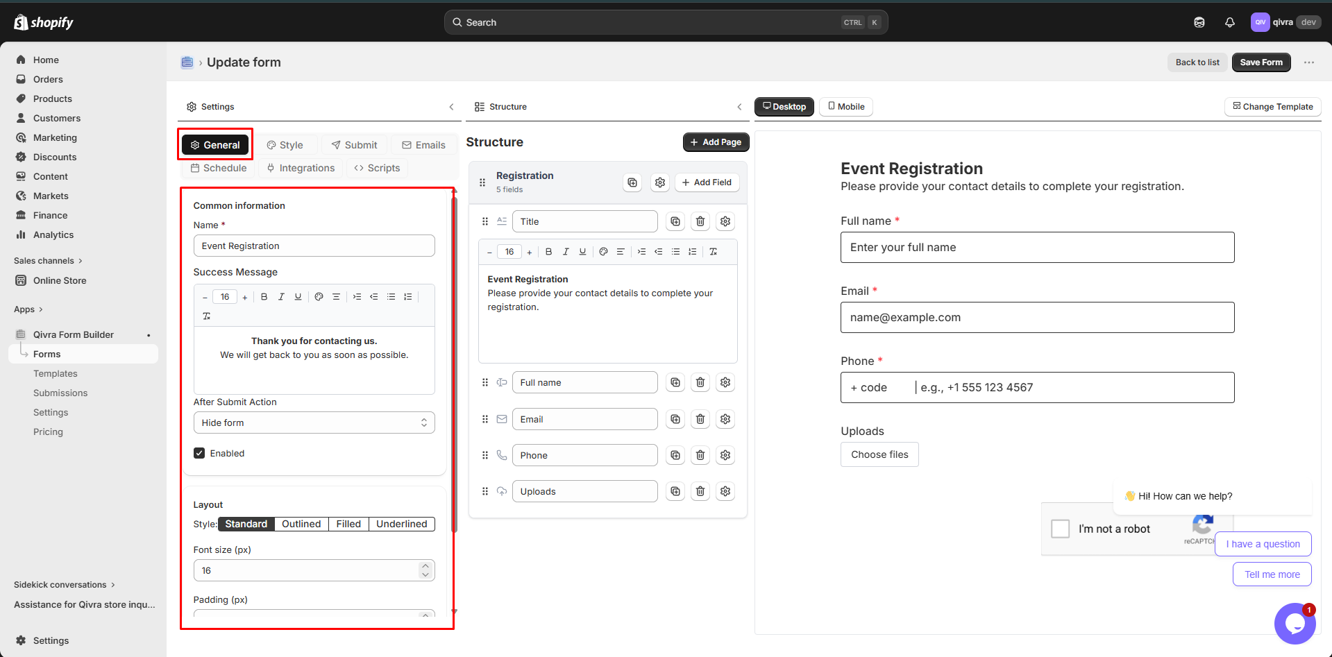
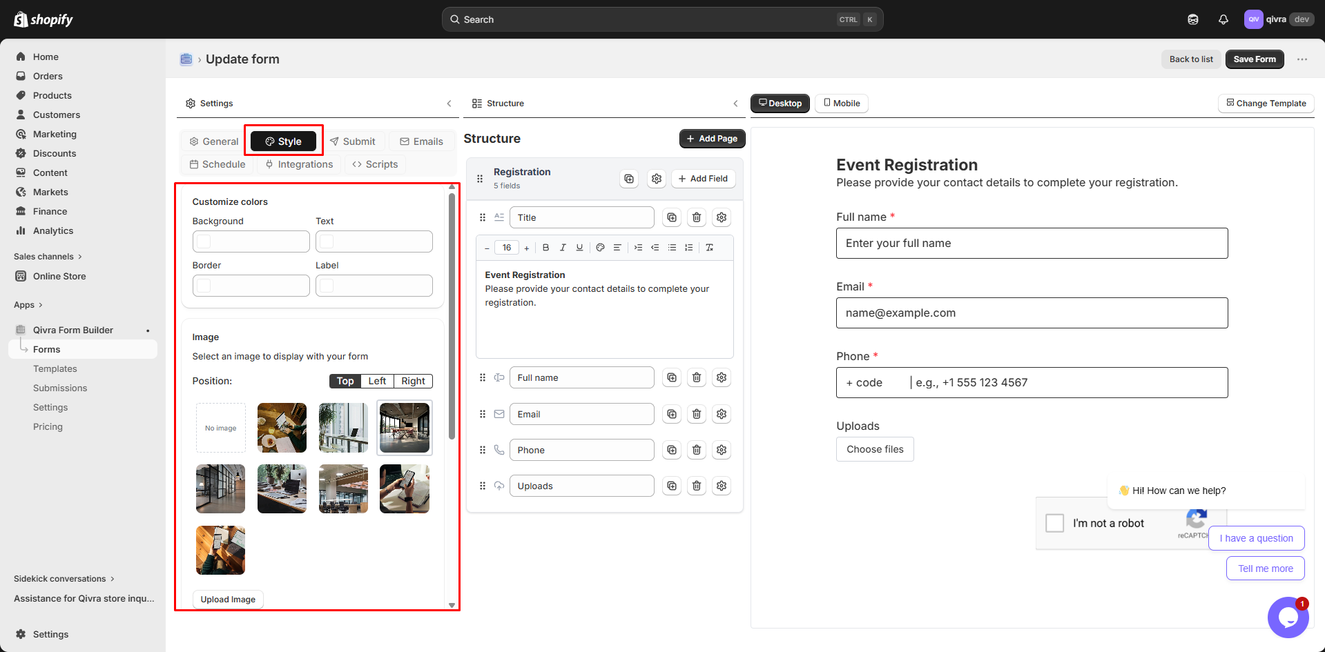
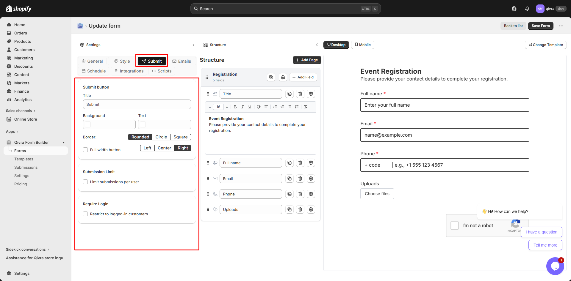
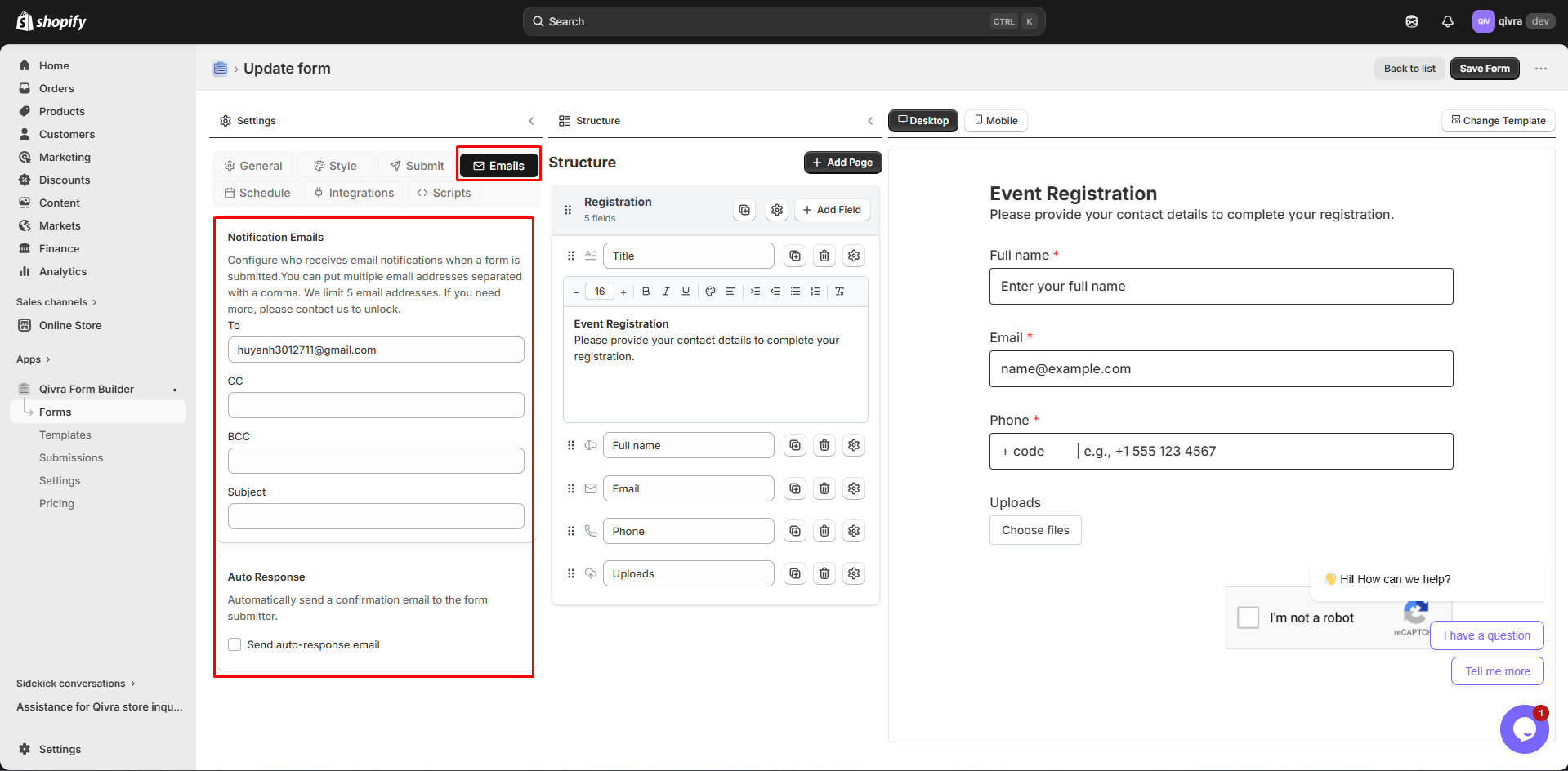
This panel contains all form-level configuration organized into tabs:
| Setting | Description |
|---|
| Form Name | Internal name for your reference |
| Description | Optional description for organization |
| Success Message | Text shown after successful submission |
| Form Layout | Overall form alignment (left, center, right) |
| Setting | Description |
|---|
| Font Size | Base text size for the form |
| Padding | Internal spacing of the form |
| Background | Color or image for form background |
| Custom CSS | Add custom CSS classes and code |
| Setting | Description |
|---|
| Button Title | Custom submit button text |
| Button Style | Border style (rounded, circle, square) |
| Button Colors | Background and text colors |
| Button Alignment | Left, center, or right alignment |
| Submission Limit | Limit submissions per user |
| Require Login | Restrict form to logged-in customers |
| Setting | Description |
|---|
| Admin Notifications | Configure emails sent to you |
| Auto-Response | Configure confirmation emails to customers |
| Email Template | Customize email content with field tokens |
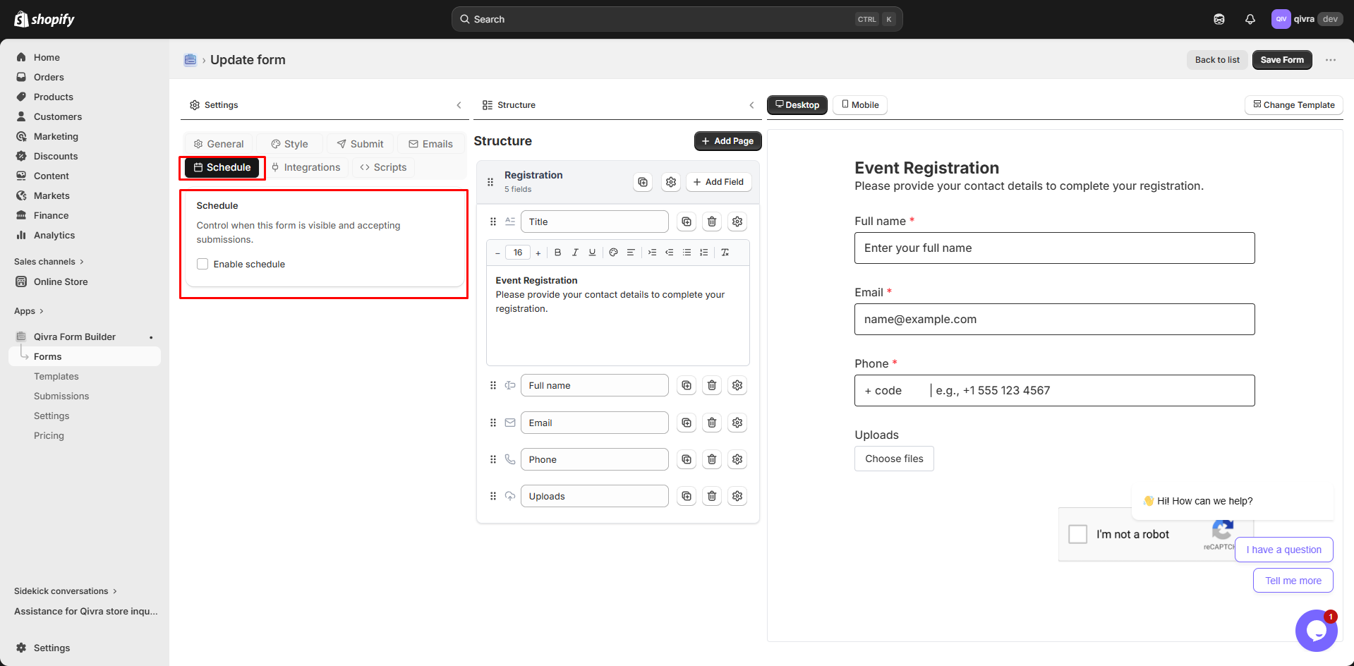
| Setting | Description |
|---|
| Enable Schedule | Turn on form scheduling |
| Start Date | When form becomes visible |
| End Date | When form closes |
| Submission Limit | Maximum number of submissions |
| Closed Messages | Custom messages when form is unavailable |
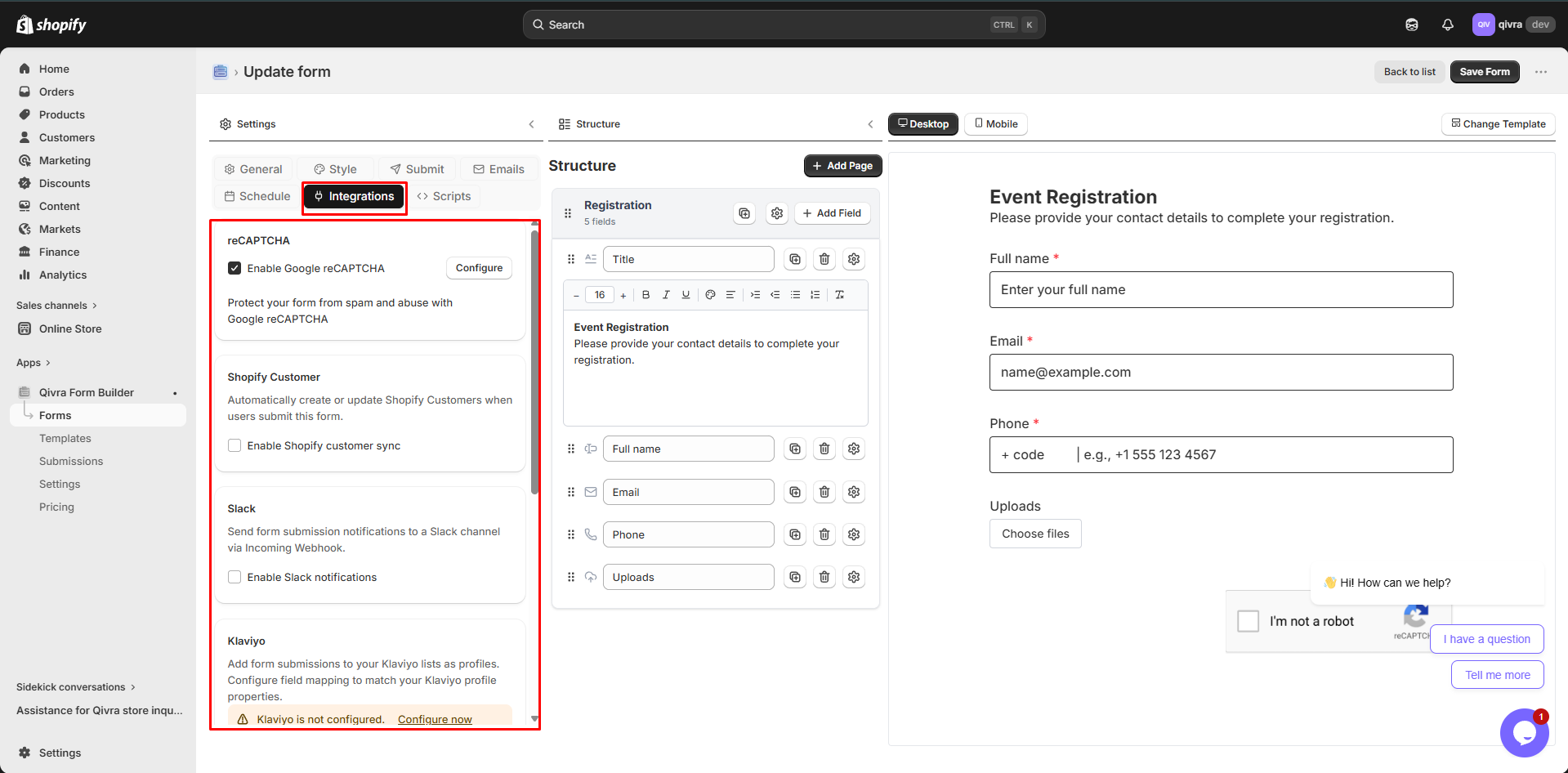
| Integration | Description |
|---|
| Mailchimp | Subscribe contacts to Mailchimp lists |
| Klaviyo | Add subscribers to Klaviyo |
| Shopify Customers | Create/update Shopify customers |
| Slack | Send submission notifications to Slack |
| Zapier | Connect with 5000+ apps via Zapier |
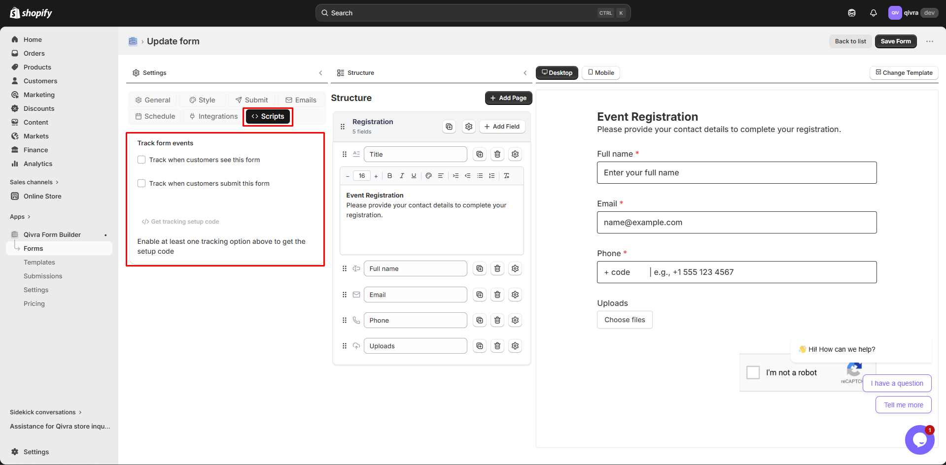
| Setting | Description |
|---|
| Track Form View | Fire event when customers see the form |
| Track Form Submit | Fire event when customers submit |
| Get Tracking Code | JavaScript snippet for tracking setup |
This is where you build your form:
- Click Add Elements to open the field picker
- Browse all available field types organized by category
- Click any field to add it to your form
- Add multiple steps to create multi-step forms
- Drag and drop to reorder steps
- Click on a step to view its fields
- Appears when you select a field
- Configure label, placeholder, validation, and more
- Settings vary based on field type
See your form exactly as customers will see it:
- Click any field to select and edit it
- Drag fields to reorder them
- Real-time updates as you make changes
- Desktop View: See how form looks on desktop
- Mobile View: See how form looks on mobile devices
- Toggle located at the top of the preview
| Button | Function |
|---|
| Desktop | Switch to desktop preview |
| Mobile | Switch to mobile preview |
| Preview | Open form in a new browser tab |
| Save | Save all changes to the form |
- Click Add Elements in the structure panel (middle)
- Browse or search for the field type you need
- Click on the field to add it to your form
- The field appears at the bottom of your form
- Click on any field in the preview (right panel) to select it
- Selected fields show a blue highlight
- Field settings appear in the structure panel
When you hover over a field in the preview, a toolbar appears:
| Icon | Action | Description |
|---|
| ⋮⋮ | Move | Drag to reposition the field |
| ▭ | Width | Change field width (1/4, 1/3, 1/2, full) |
| ⧉ | Duplicate | Create a copy of the field |
| 👁 | Hide | Temporarily hide from customers |
| 🗑 | Delete | Remove the field permanently |
- Hover over the field you want to move
- Click and hold the Move icon (⋮⋮)
- Drag the field to its new position
- Release to drop it in place
- Click Add Step in the structure panel
- A new step page is added to your form
- Drag and drop steps to reorder them
- Click on a step to configure its settings
- Set step name and description
- Configure conditional logic for showing/hiding the step
- Each step contains its own set of fields
- Click on a step to view and edit its fields
- Drag fields between steps to move them
Form-level settings are organized in the left panel tabs:
- General Tab: Form name, description, success message
- Style Tab: Fonts, colors, background, custom CSS
- Submit Tab: Button settings, submission limits, login requirements
- Emails Tab: Notification and auto-response settings
- Schedule Tab: Form availability and limits
- Integrations Tab: Third-party service connections
- Scripts Tab: Event tracking setup
- Use the desktop/mobile toggle for responsive preview
- Changes update instantly
- Test form interactions in real-time
- Click Preview in the top toolbar
- Form opens in a new browser tab
- See exactly how it will appear on your store
- Test all functionality including submission
| Shortcut | Action |
|---|
Ctrl/Cmd + S | Save form |
Escape | Deselect current field |
Delete | Remove selected field |
Ctrl/Cmd + Z | Undo last action |
- Group related fields together using steps
- Use dividers to separate sections
- Keep forms concise for better completion rates
- Save frequently to avoid losing work
- Test on both desktop and mobile views
- Use the preview function before going live
- Set up form-level settings before adding fields
- Configure form settings in General tab
- Add and organize form steps
- Add all needed fields to each step
- Configure individual field settings
- Set up styling in Style tab
- Configure notifications in Emails tab
- Set up integrations if needed
- Preview and test thoroughly
- Save and publish
Play